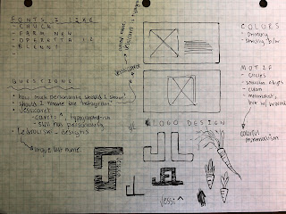
OK so I think I am going to go with my branding idea.
Here are some ideas.
Here are some ideas.
I made my instagram in 2017 so the same isn't the most professional (jesssicarrot, a nickname from HS). I could change it to something like ledrowski_designs or I could go with jessicaret (caret= ^ ) which could reference typography or design in general. I've been looking at the rebrand of &Walsh, and how it focus in on the ampersand, so I could try something like that.
&Walsh: (I really love how she chose to brand her business, just some inspiration.)
Heres a color scheme, I am using it on the website I am coding for another class:
The Website (in progress!): http://www.appstate.edu/~ledrowskije/Portfolio/index.html
Yeah thats what I've got for now.


I think the caret (^) idea is really clever, especially how you explained it relates to graphic design. The ampersand (&) is also pretty cool, but I've seen it before, quite a bit. I hardly ever see the caret used. I'd like to see you push that. Your color scheme is pretty and works well. Great progress!
ReplyDeleteI like that you're taking this project more toward typography! I also think the caret is a great idea and I like seeing how you are planning everything out.
ReplyDelete