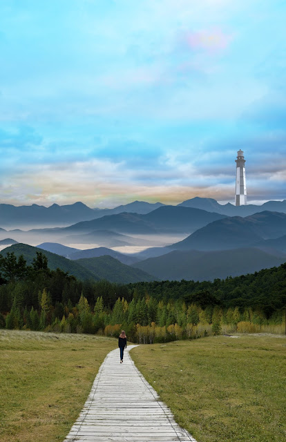
Have not been able to work on this as much as I had hoped, but theres still a lot of time for improvement. Let me know what you think! I need to make the lighthouse either blend in or stand out more, and I am open to suggestions for adding new elements. I composited the image in the original post out of 7 different landscape photos, and I have edited and improved the masks since then, let me know if there are any problem areas that could be blended better.

I think so far everything is composited and put together really well. Personally I think the foreground is lacking a bit, maybe you could edit the figure to be larger (or maybe not larger but more towards "us"). I really love the colors in the landscape and sky.
ReplyDeleteI love the concept behind this and I think it's off to a strong start. I agree that the lighthouse needs something so adding a pop of color could help or even adding some light coming from the top of it. I think you have done a great job compositing the landscape images together, something about the foreground feels maybe a little too overpowering right now possibly just because of how much space it takes up or because color wise it grabs your attention the most but I think making the lighthouse pop could definitely help balance things more. Overall I really like it so far and I'm excited to see what else you do with it!
ReplyDeleteI miss the mountains :( your image is really pretty and I like the surreal aspect to it! I agree that the foreground is a little sparse compared to the rest of the image- maybe you could bring in more blue tones to connect with the background? Or do the opposite color (red/pink) to really make it funky?
ReplyDeleteNice compositing in general, the lighthouse in the back does look a little out of place. I think it may be because it is not as blurred and foggy as things tend to be when they're far away (like those mountains). I would say either move the lighthouse closer in the frame or make it a little foggier so it doesn't jump out so much.
ReplyDeleteI like the composition you have going on. I feel as if you should make the lighthouse stand out differently than the rest of the composition, right now its looking out of place.
ReplyDeletei enjoy how the lighthouse is not actually standing out that much. You are clearly on a journey going somewhere to do something and lighthouses are a sense of guidance "guiding" you somewhere. I think if you made the lighthouse stand out more it might seem like that is your destination instead of it helping you on your journey.
ReplyDeleteFrom Lauren B - Jessica Ledrowski
ReplyDeleteThe rule of thirds is really working well for this composition. I love the idea behind this narrative but I wish there was a better sense of time in this image. Perhaps try a blending mode to make all the layers seem more unified.
From Cameron
ReplyDeleteOverall this is so cool to look at and the pieces are blended well together. I agree the lighthouse could have more light around it or coming from it to add emphasis. Also, I think the figure could move a little closer to the viewer for emphasis on that but just an idea!